Project overview
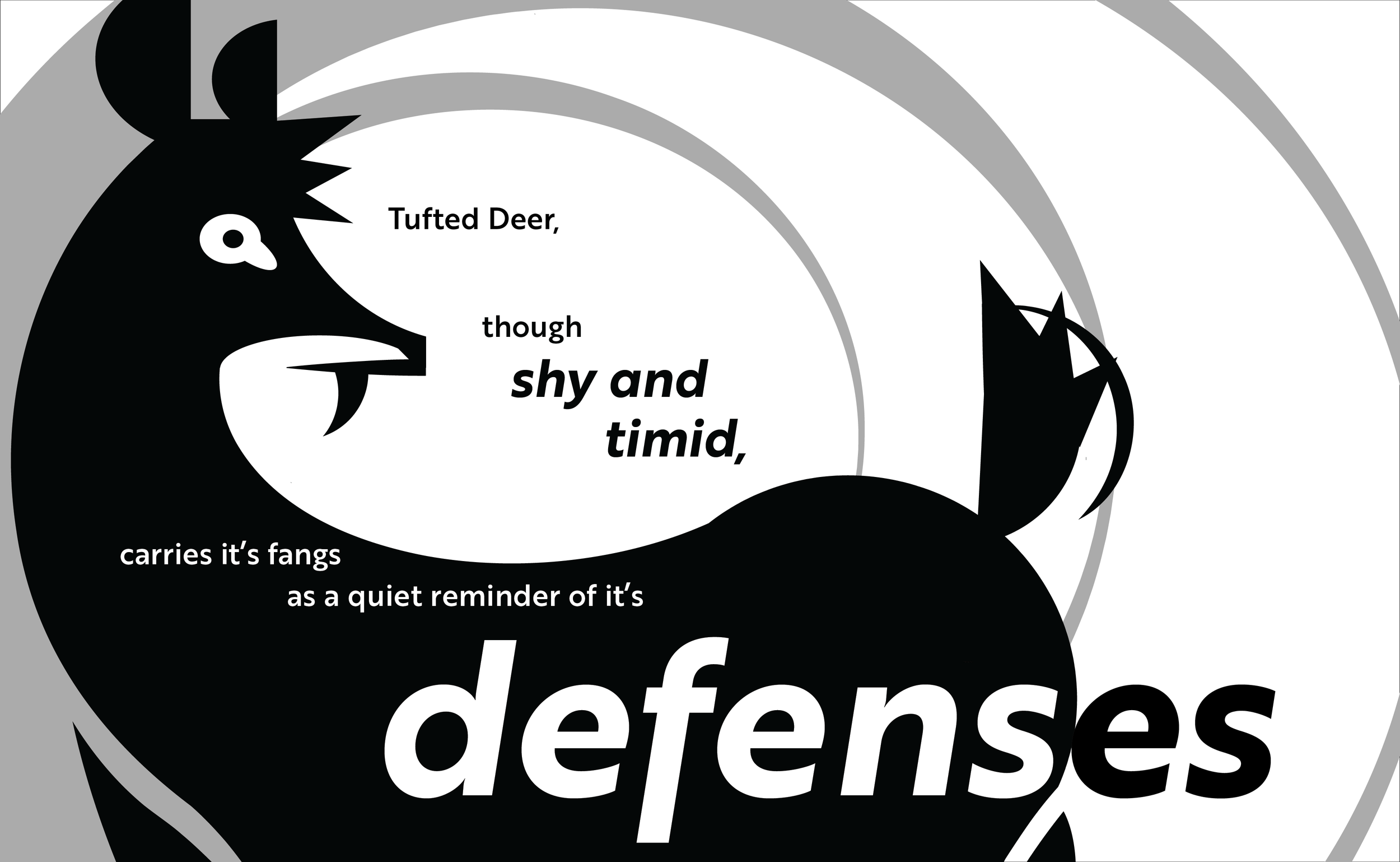
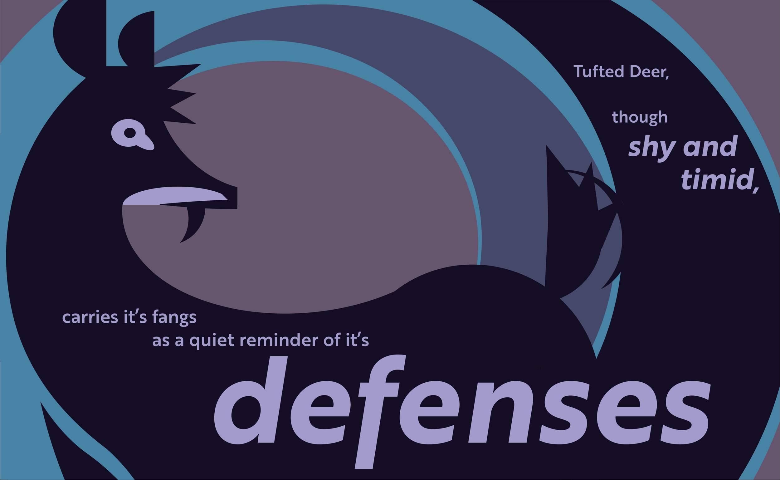
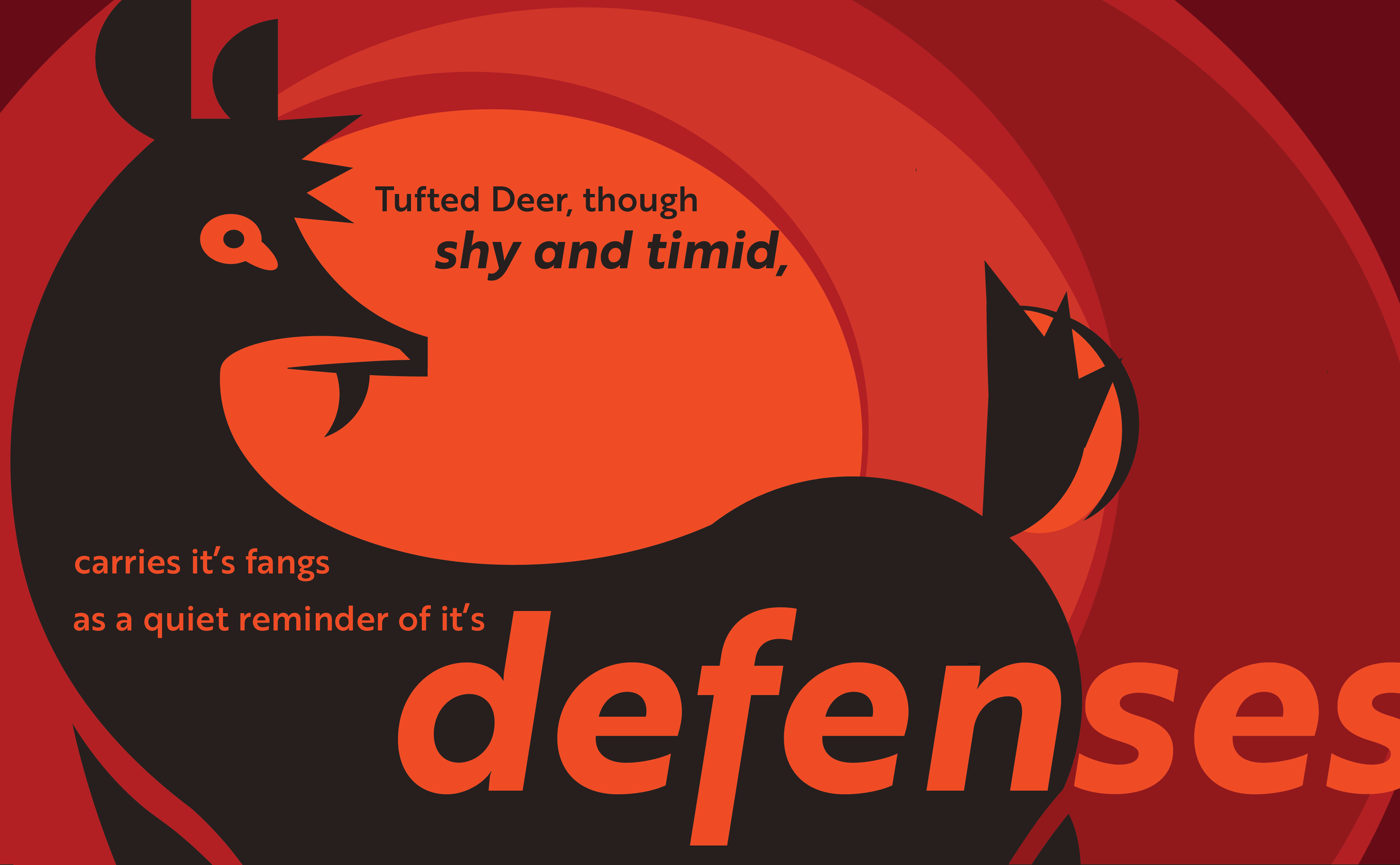
The goal of this project was to create a graphic representation of an animal of my choosing, the tufted deer, based on inherent shapes and structures, emphasizing key physical and associative attributes, and to then incorporate the graphic into a full composition using color and typography.


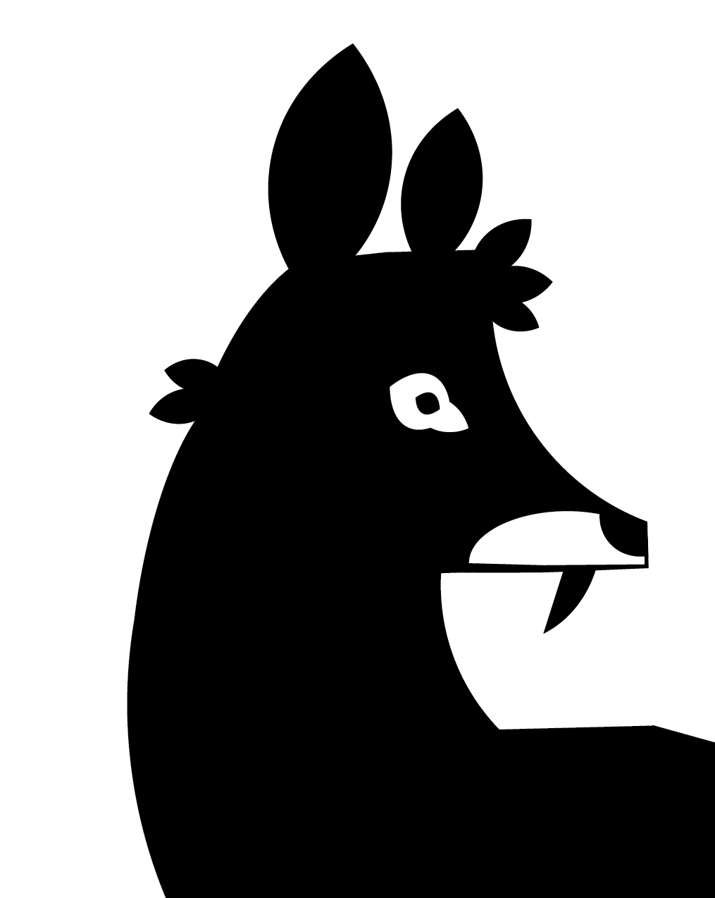
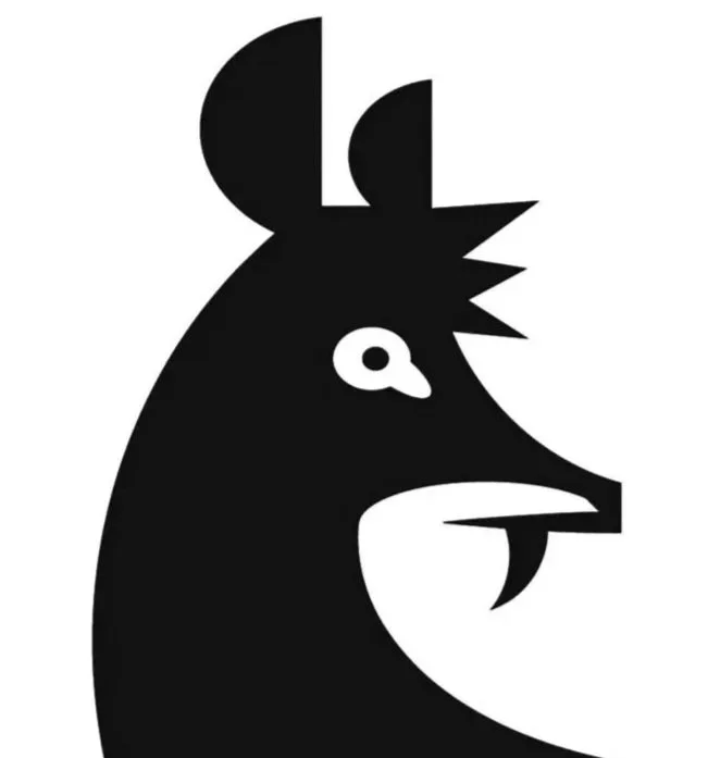
The Tufted deer is a small species of deer native to Southeast Asia and is one of many subspecies of Asian deer known as vampire deer due to their pronounced canines. This species is named specifically for its darkly colored hair on the top of its head. When crafting my mark it was essential to communicate both its namesake and its equally iconic tusks. I also aimed to express the deer's cautious and timid nature, emphasizing alertness and awareness of its surroundings.
Creature Research
Sketching and ideation
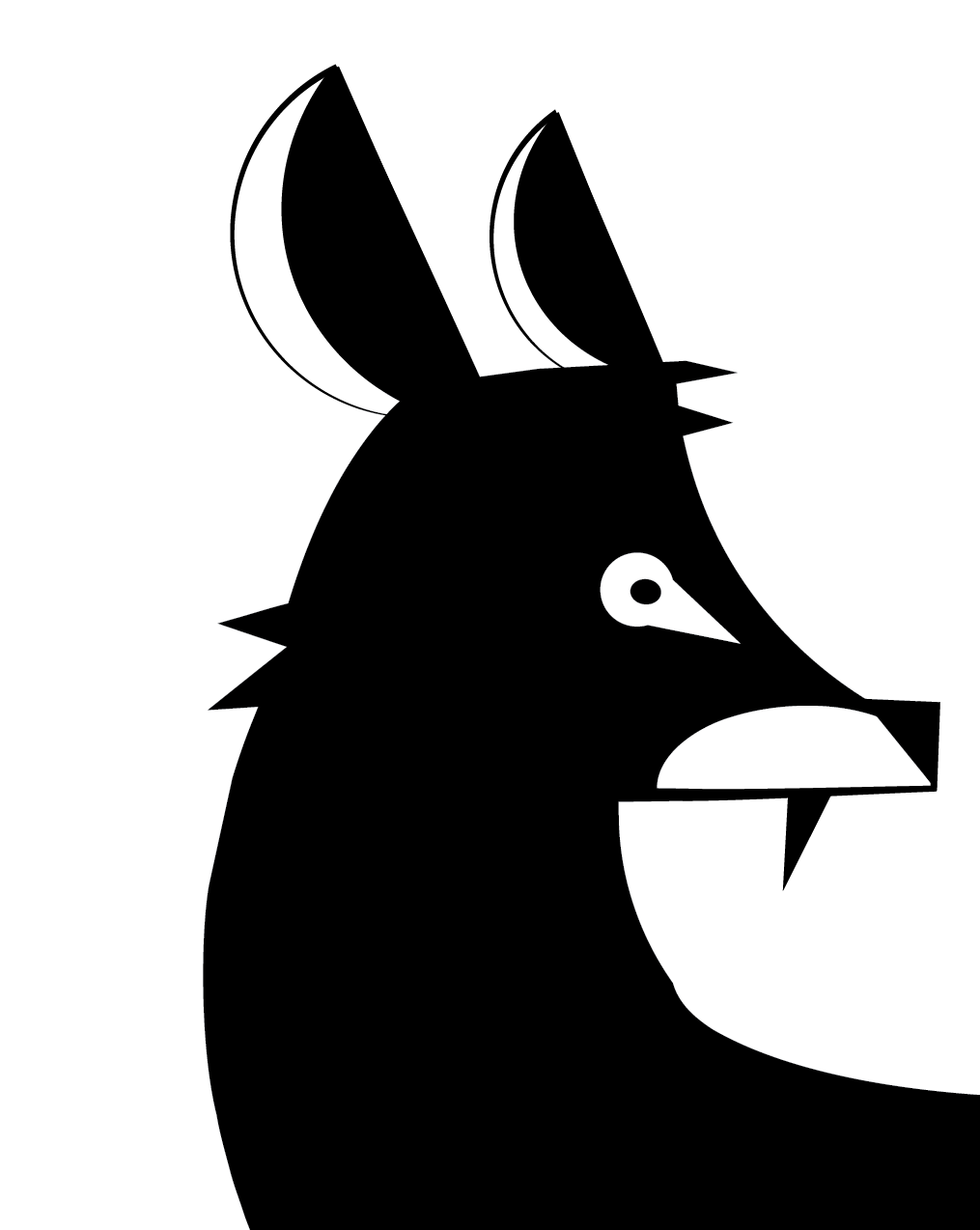
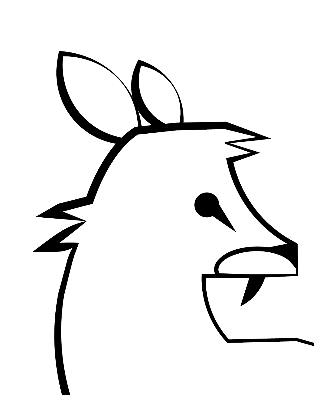
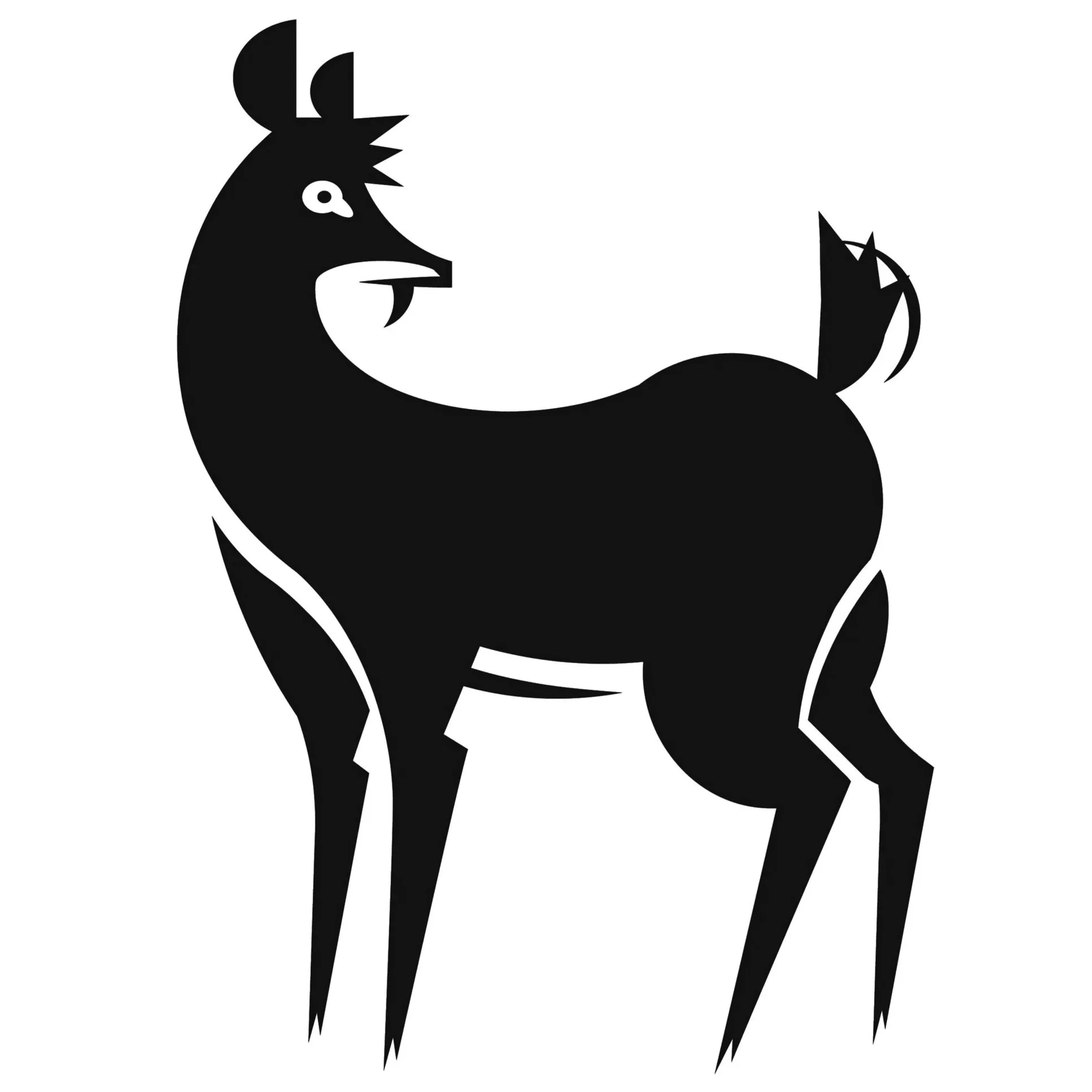
After I chose my animal and researched, I began sketching to better understand the shapes that make up its structure as well as what pose would best represent my creature. I found a side profile was the best way to capture the tusks and hair through a strong silhouette.

shape and weight exploration
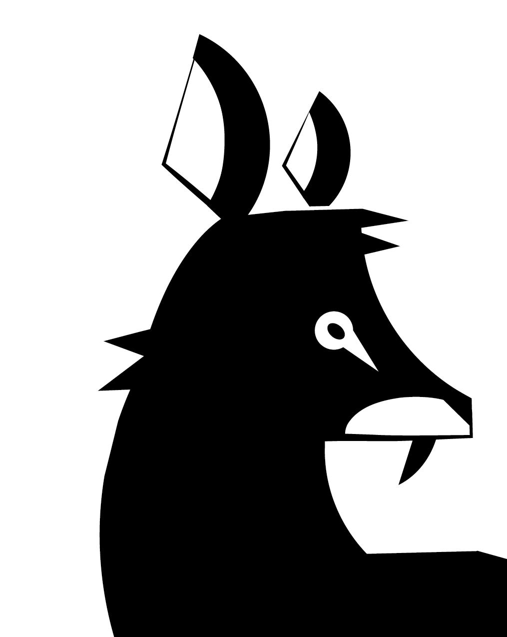
Based on my sketches, I moved to Adobe Illustrator to refine my ideas. I focused initially on the head, since its tufted hair and fang-like tusks are the most distinctive features of the species. I experimented with different shapes and line weights to find the best way to represent these key features accurately.
Refinement
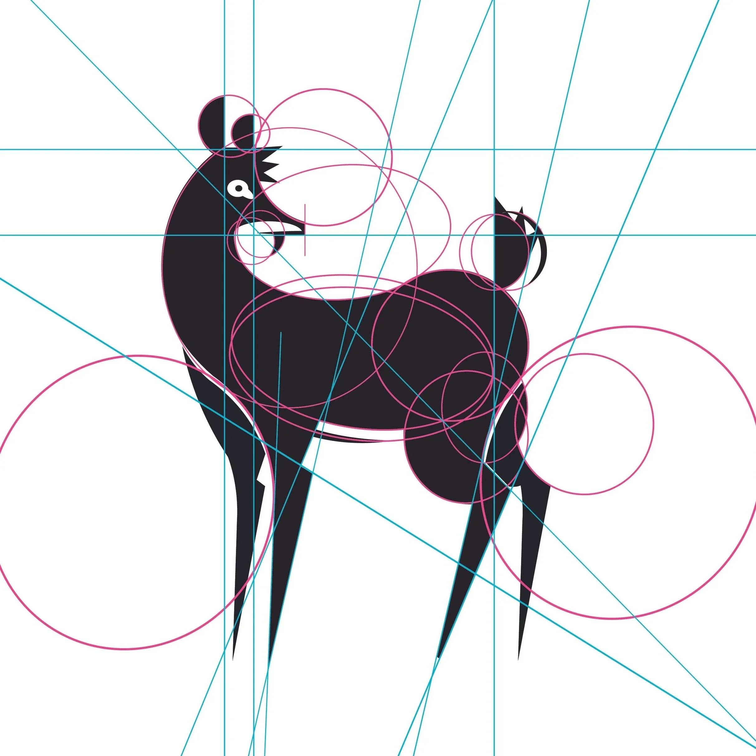
I explored several body shapes, initially starting with a more angular and blocky from. I ended up with a rounder, curved body to better capture the graceful, light qualities typical of a deer. The curve also draws the eye back to the head where the most distinctive features lie.
Final Mark
composition exploration
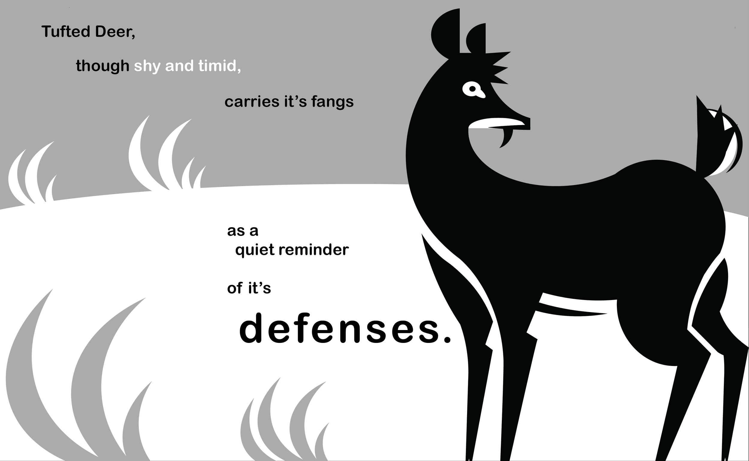
Once I had completed the creature mark I began trying compositions. I wanted to express the chosen phrase with a typeface that complimented the mark, so I chose Brother 1816 by FernandoDíaz for its simultaneous roundness and sharp lines. I also landed on this typeface due to the the fact that, when italicized, the descender on the the letter "F" extends below the baseline, which I thought was a nice subtle nod to the deer's tusk.


color application
When applying color, at first I wanted to convey the deer's crepuscular nature utilizing blues and purples, however, as I experimented, I found that a contrasting palette based around the complimentary colors of red and green better conveyed the dual nature of the deer instead. I colored the majority of elements in shades of green to evoke calmness and tranquility while circling the deer in red to point at the hidden dangerous potential it holds in its natural defense.

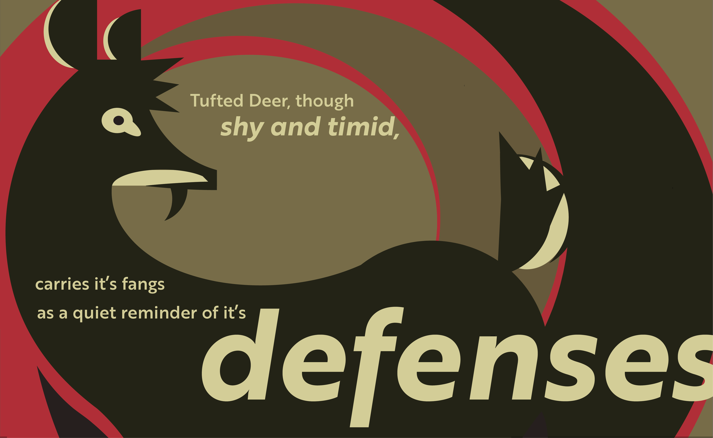
Final color palette and Composition