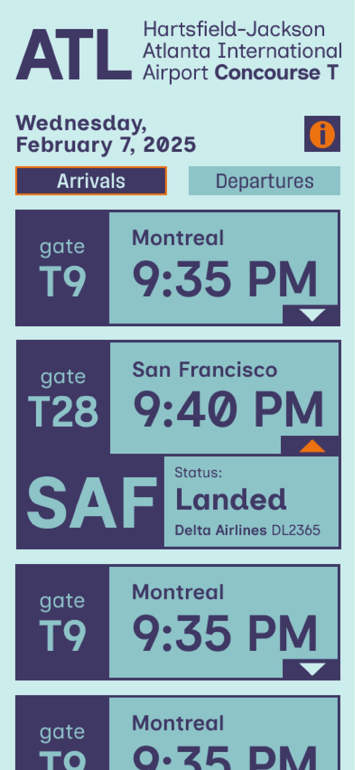
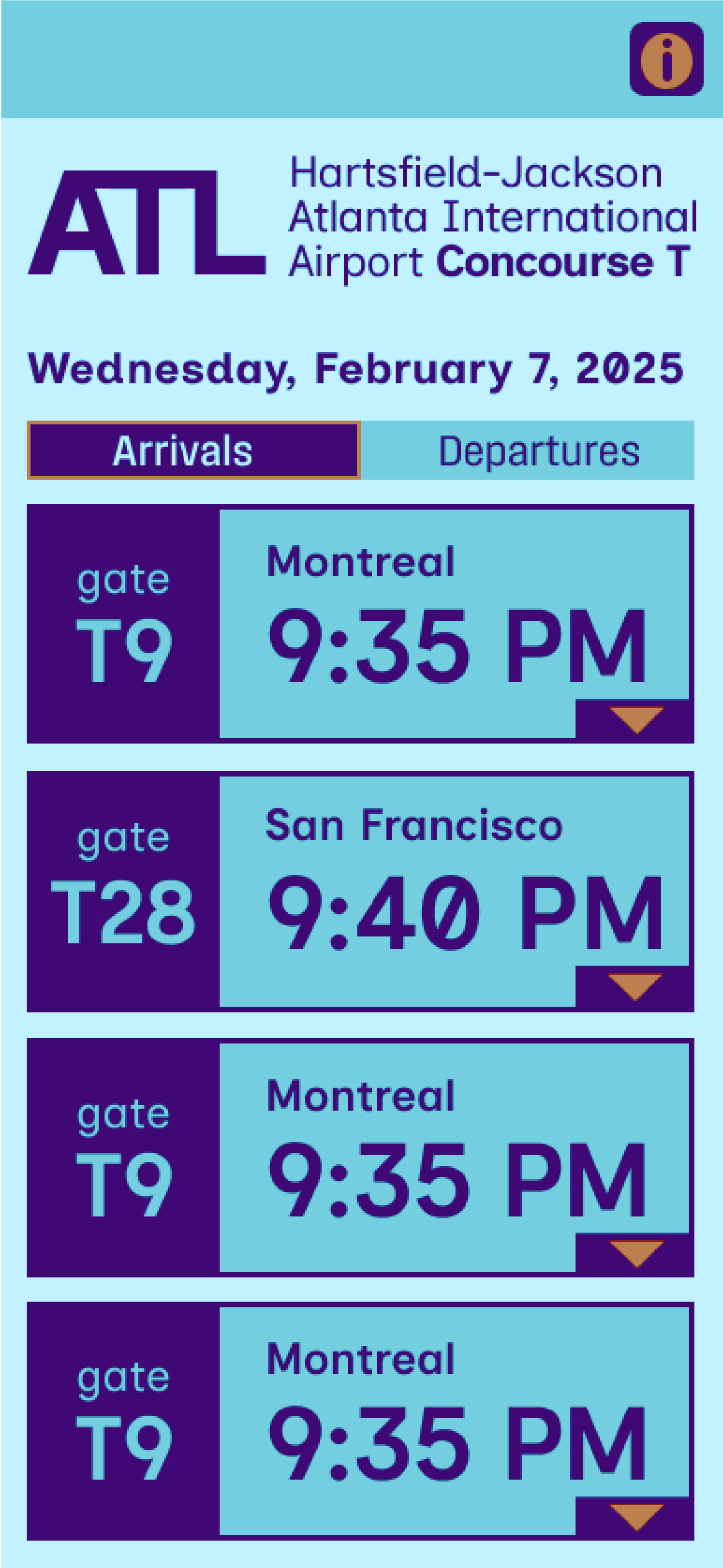
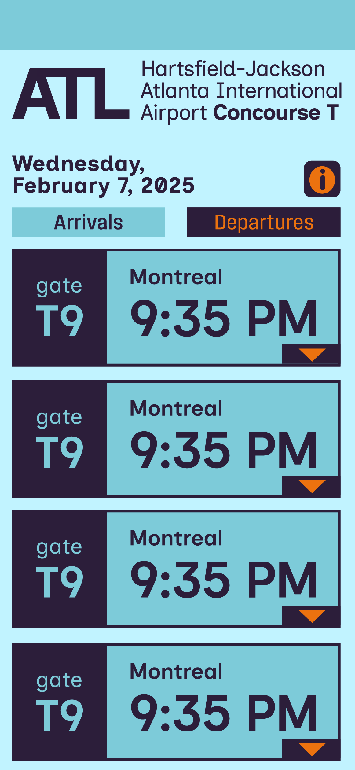
Project overview
The goal of this project was to use Figma to prototype an app interface for the Atlanta International Airport. I wanted my design to feel nostalgic and retro. I drew a lot of inspiration from vintage luggage tags and license plates to capture the excitement of travel that I feel is lost in the modern day. Another main goal was to gear the design towards people with ADHD.
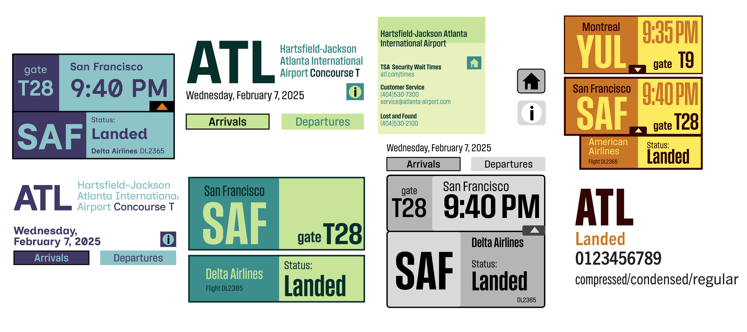
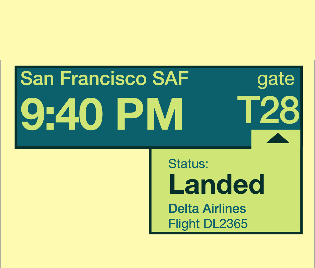
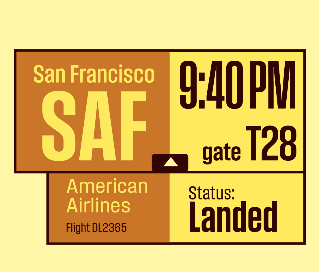
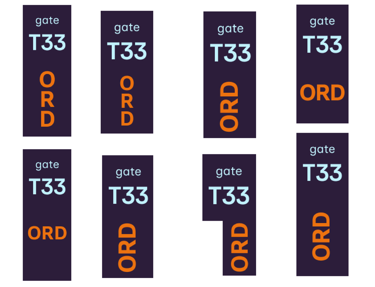
typeface and color experimentation
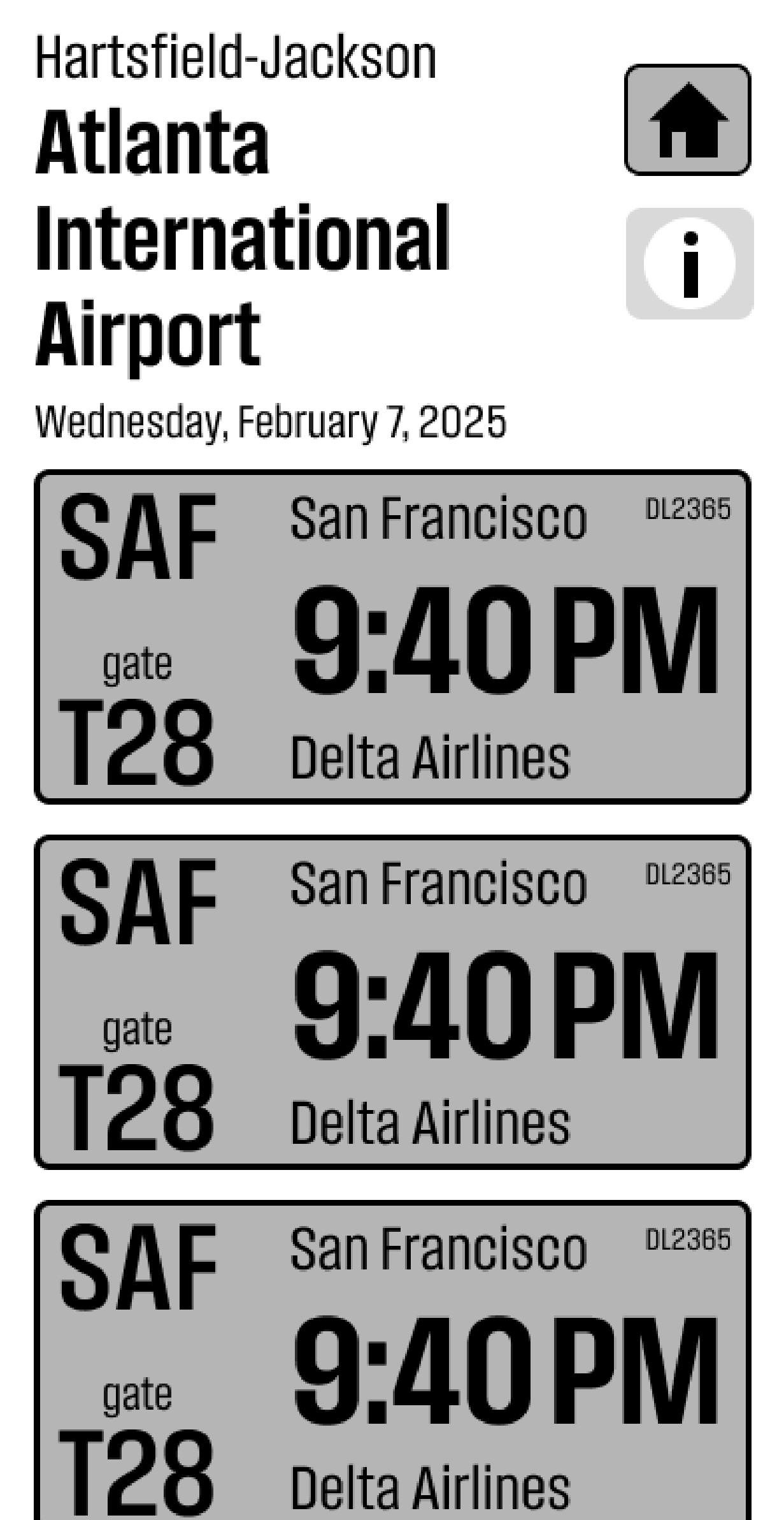
When selecting a typeface, I was initially torn. I really liked the vintage travel tag/ license plate vibe of compressed Trade Gothic, but Inclusive Sans seemed to better align with the ADHD-focused design. I ultimately chose Inclusive Sans because its number display is far more readable than Trade Gothic.
Refinement
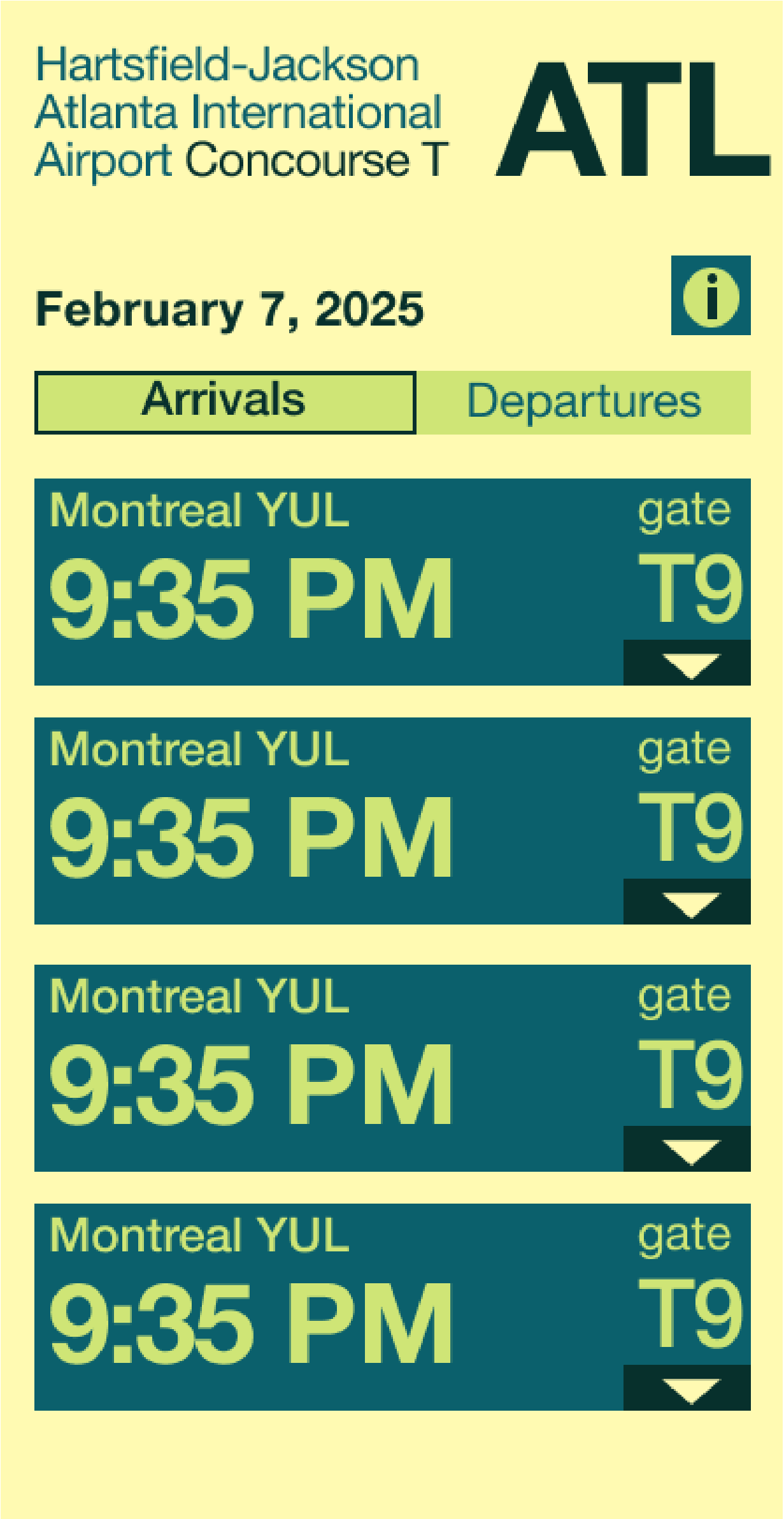
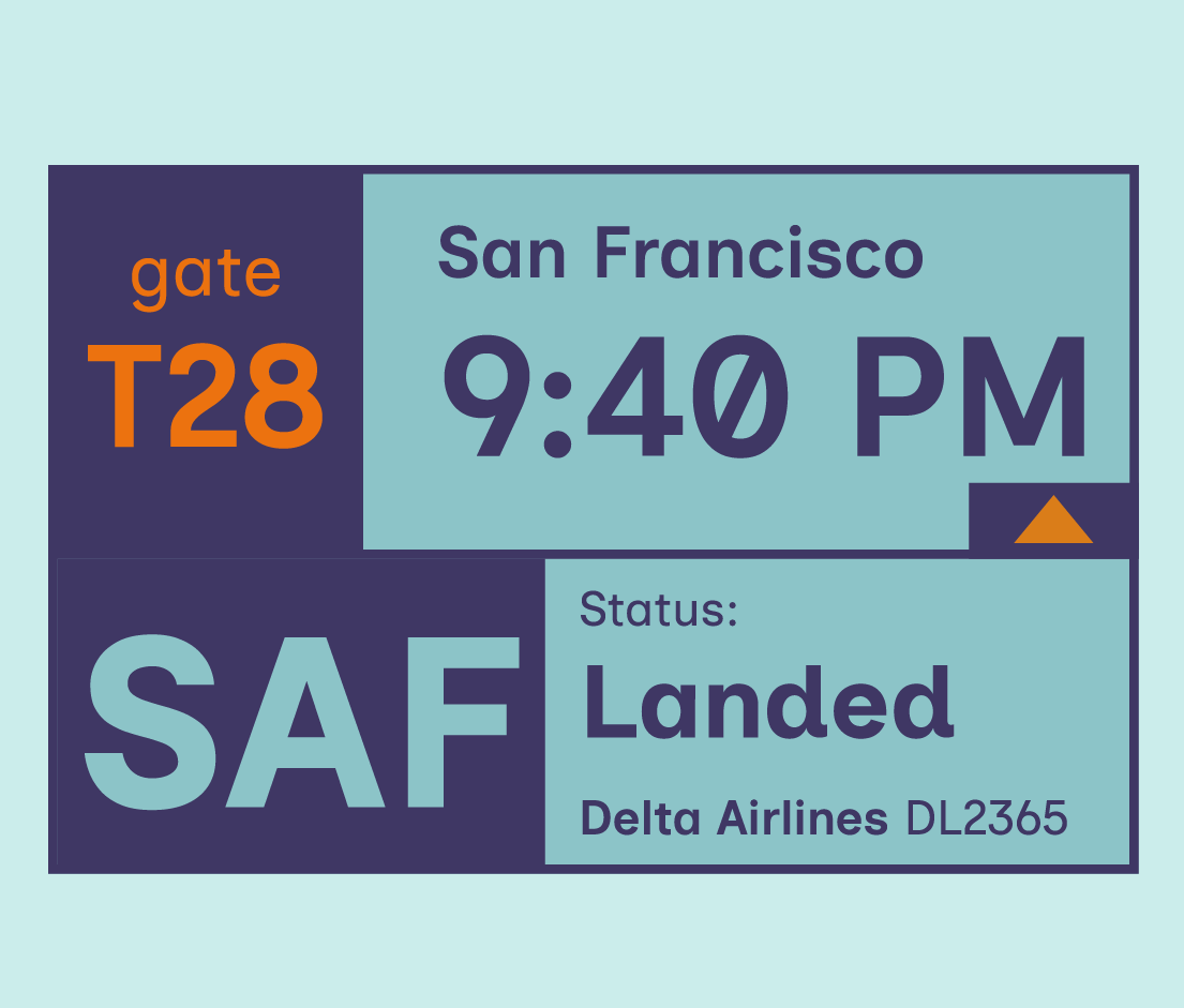
I wanted the interface to be colorful and high-contrast, similar to old luggage stickers and license plates. I ultimately based the palette in blues because blue is a calming color and airports can be stressful enough, especially for neurodivergent people,


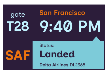

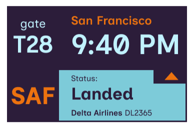

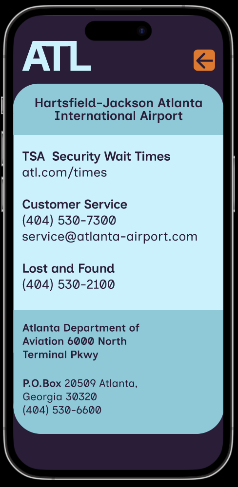
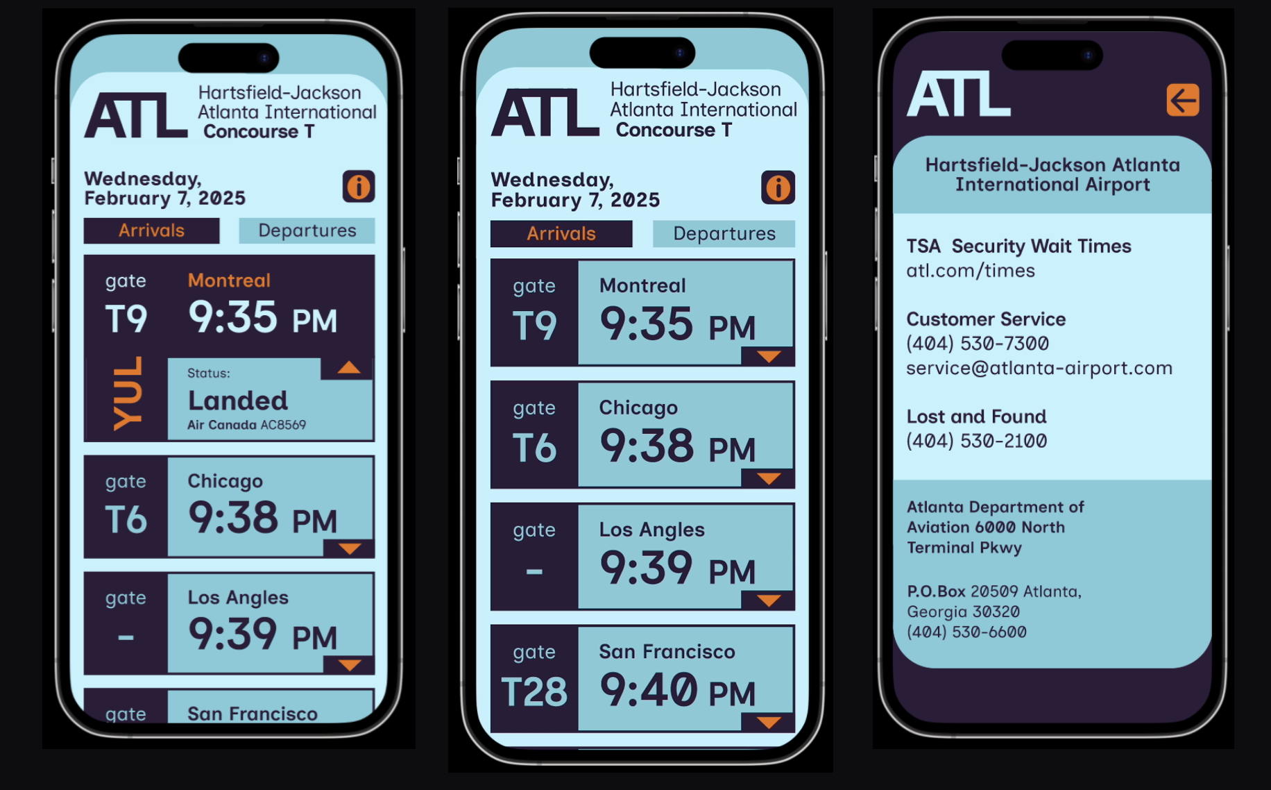
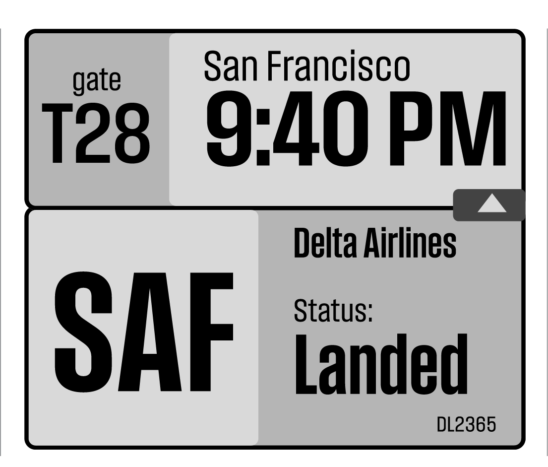
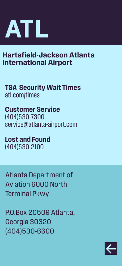
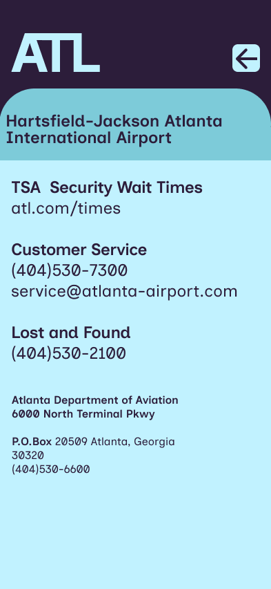
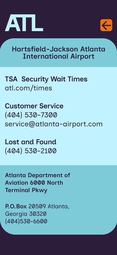
Additional info screen

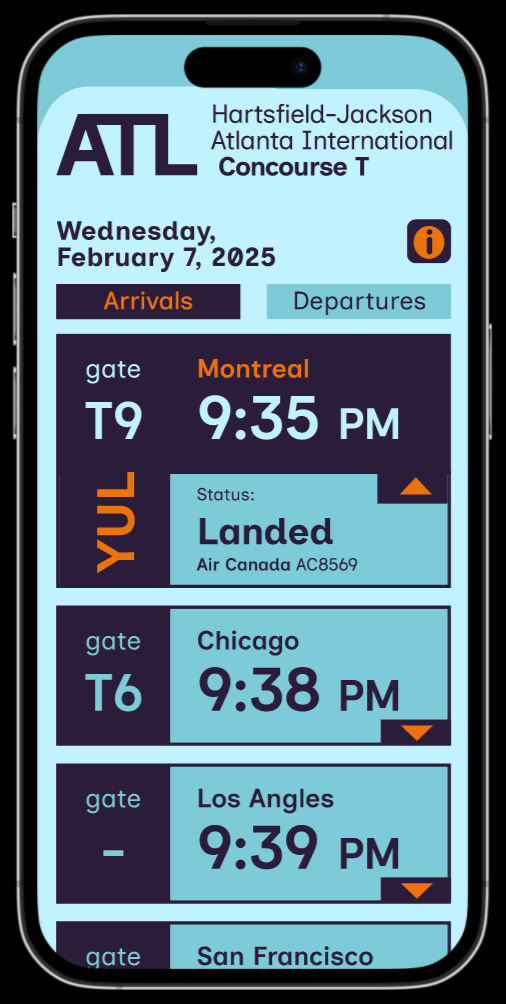
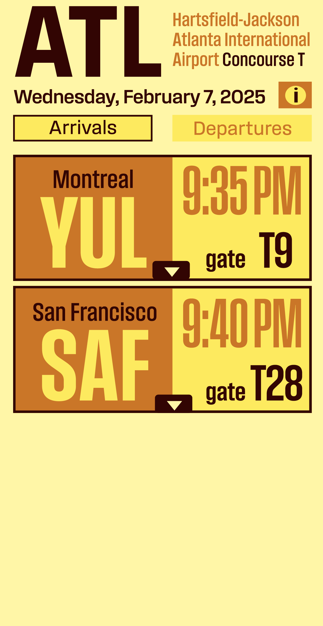
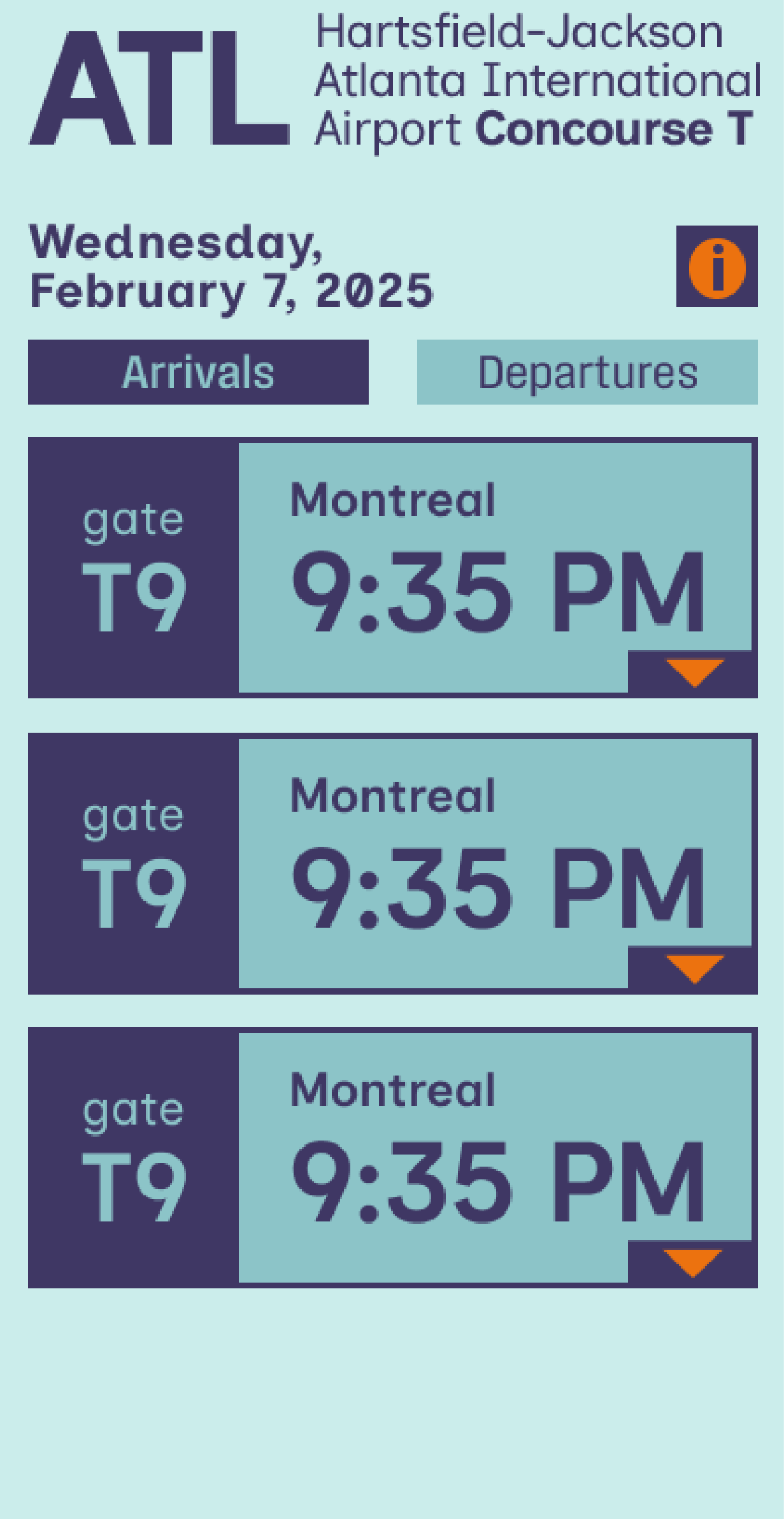
Final prototype