Project overview
This project involved creating branding for a fictional company I wish existed:
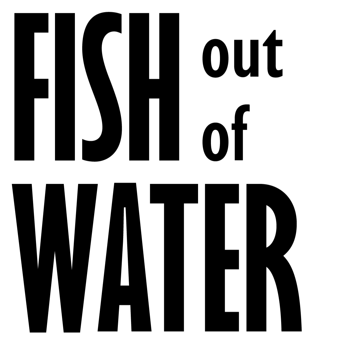
a consulting and training firm for creatives entering corporate environments. I named it “Fish out of Water” to reflect how unfamiliar and overwhelming corporate settings can feel to young creatives. The brand’s goal is to reassure and empower them, showing they can adapt and succeed. I designed the branding with people my age in mind, as many of us are transitioning from design school into professional, often corporate, careers for the first time.
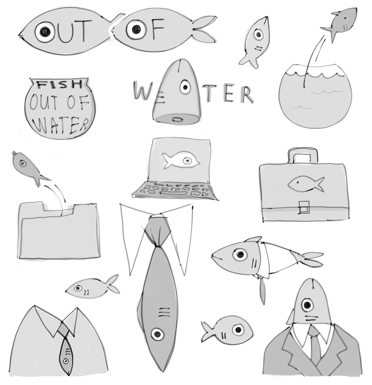

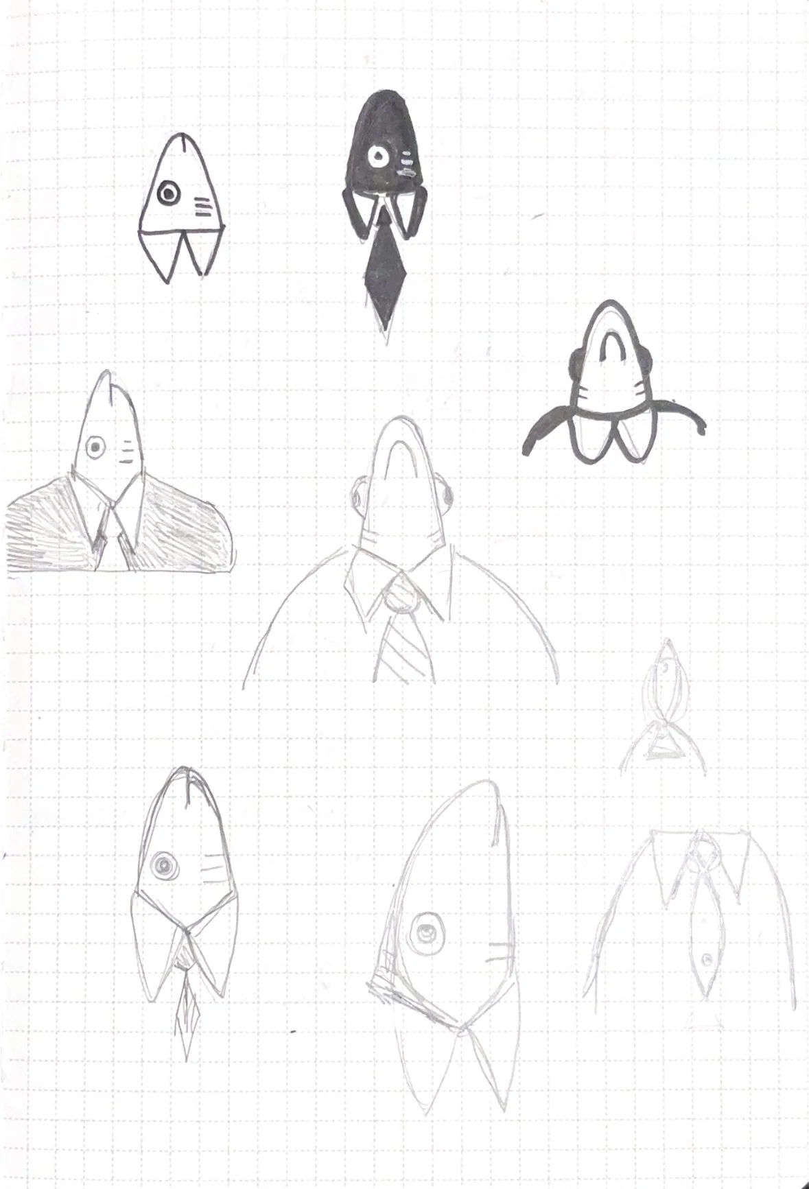
Sketches and ideation
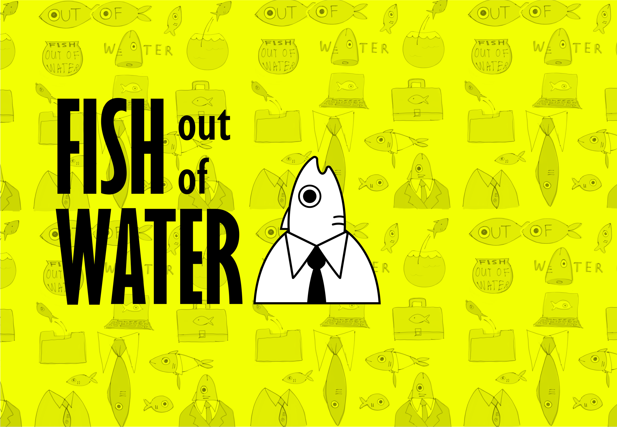
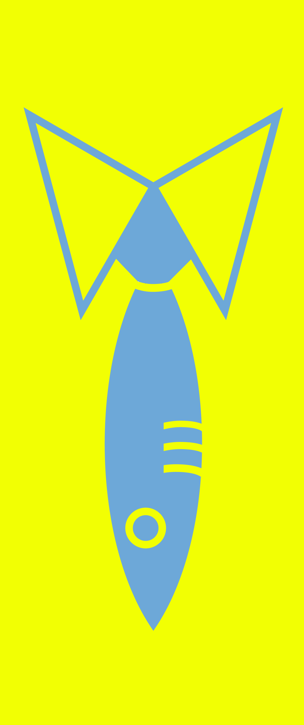
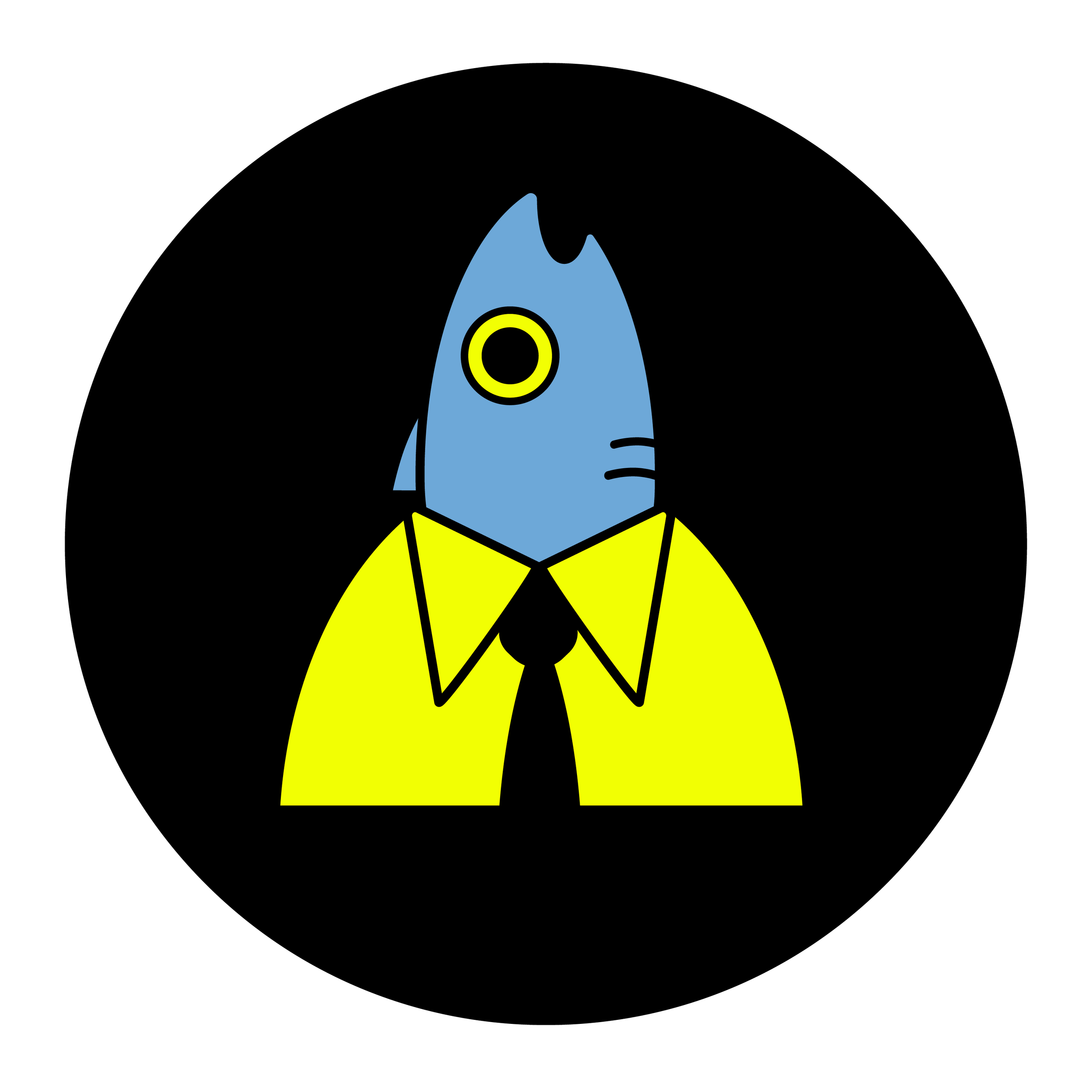
When sketching the logo, I leaned into a literal interpretation of the brand name, playing with the juxtaposition of fish and corporate imagery like suits, ties, and briefcases. I wanted the logo to feel approachable and playful, so I focused on turning the fish into a cute and friendly mascot character for the brand.


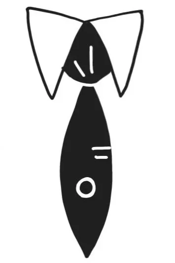
Digital logo iterations
I moved forward with two of my logo concepts and brought them into Illustrator to digitize.
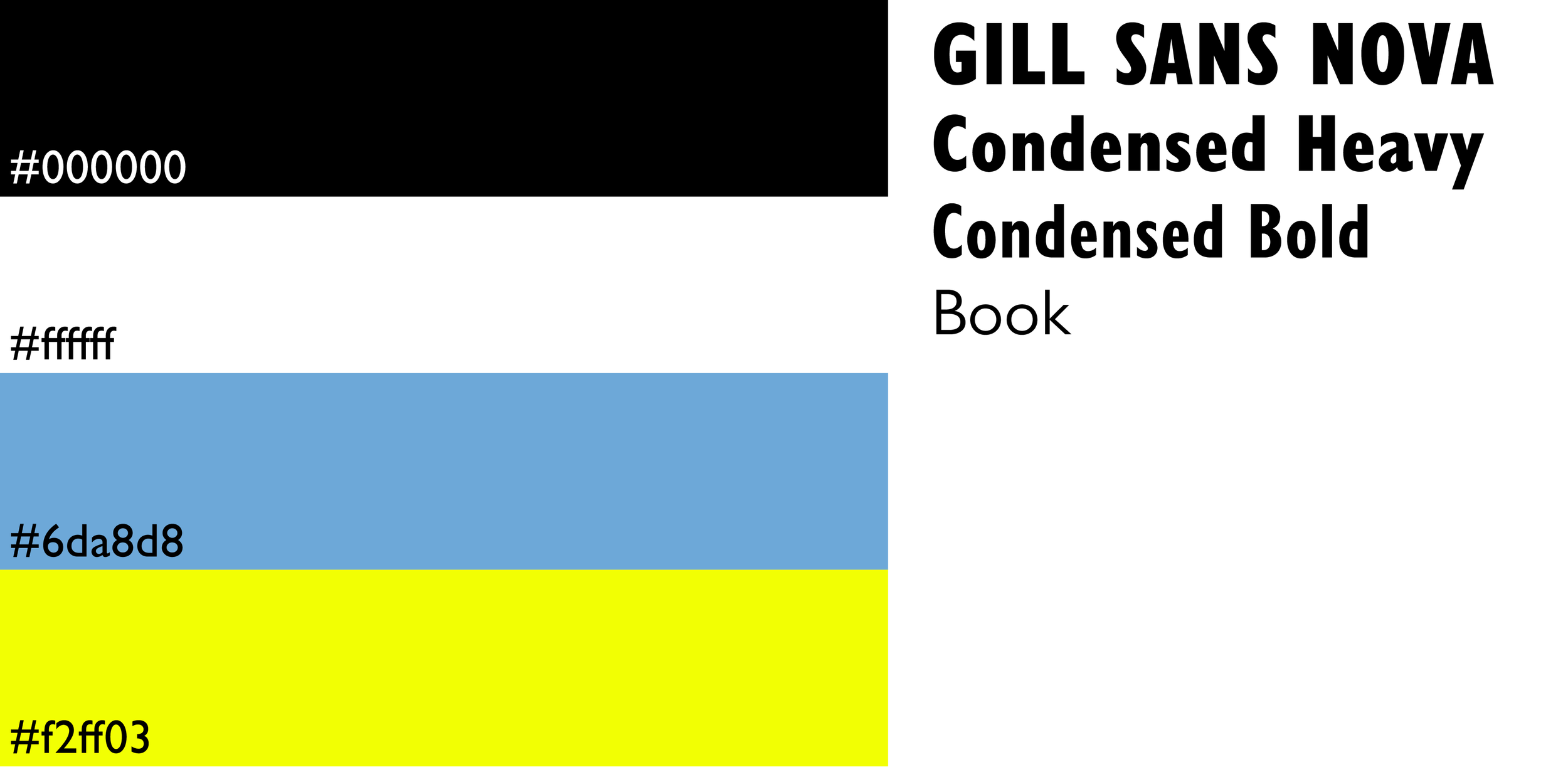
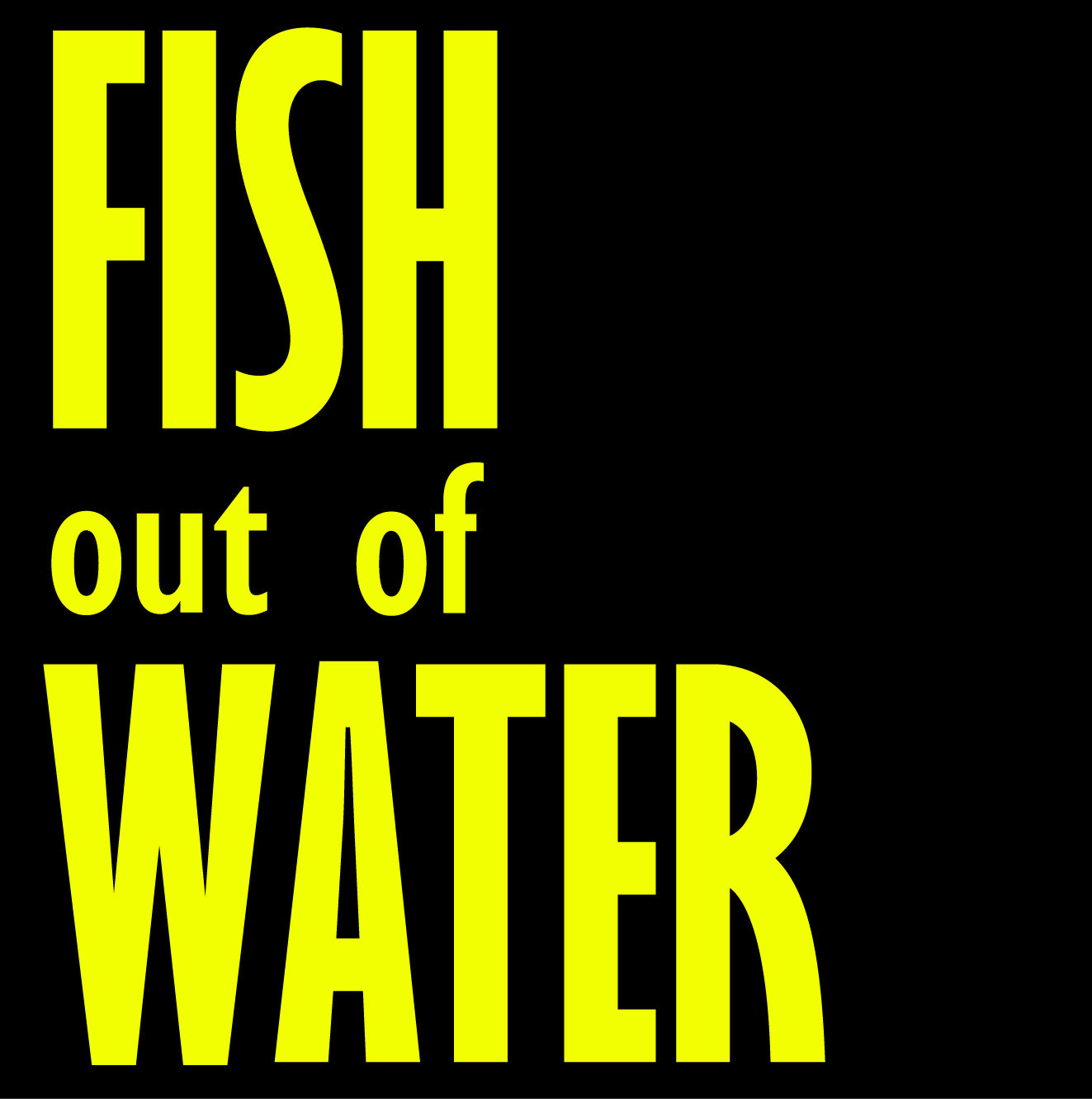
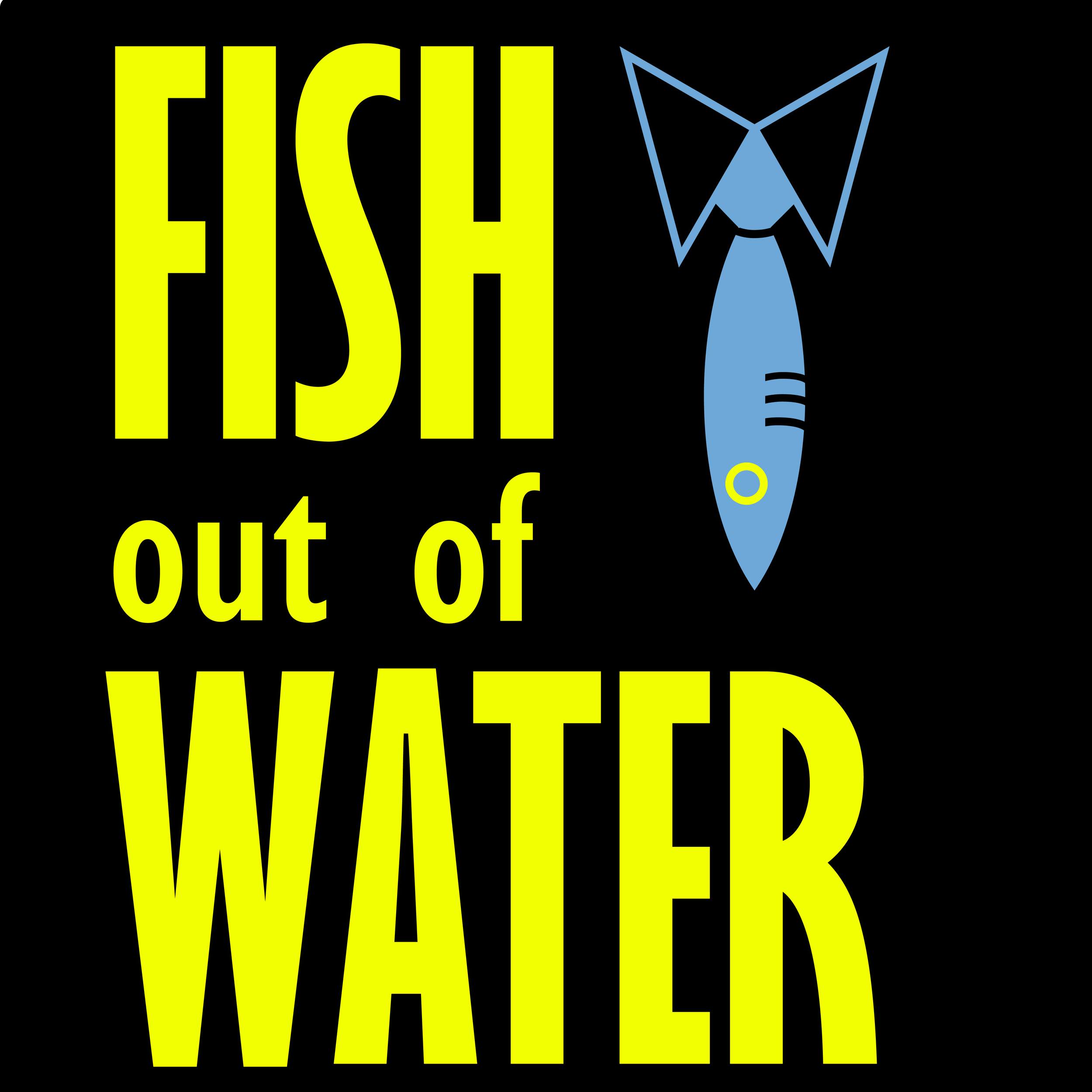
Brand colors and typography
In addition to the logo, I chose a color palette, selected a typeface, and created two versions of a wordmark to round out the visual identity.
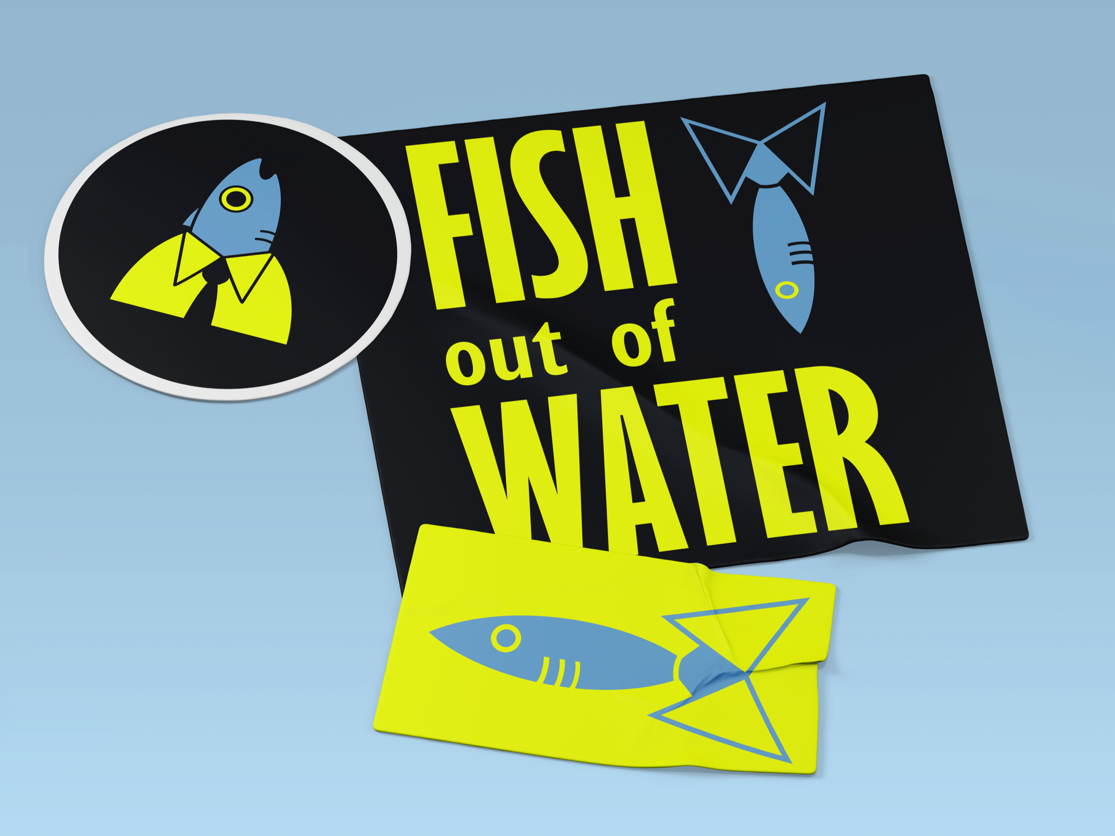
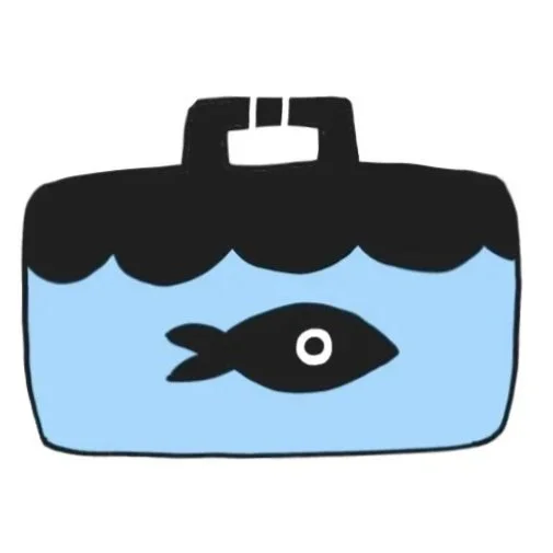
stickers
I created a branded set of stickers from the logos and wordmark.
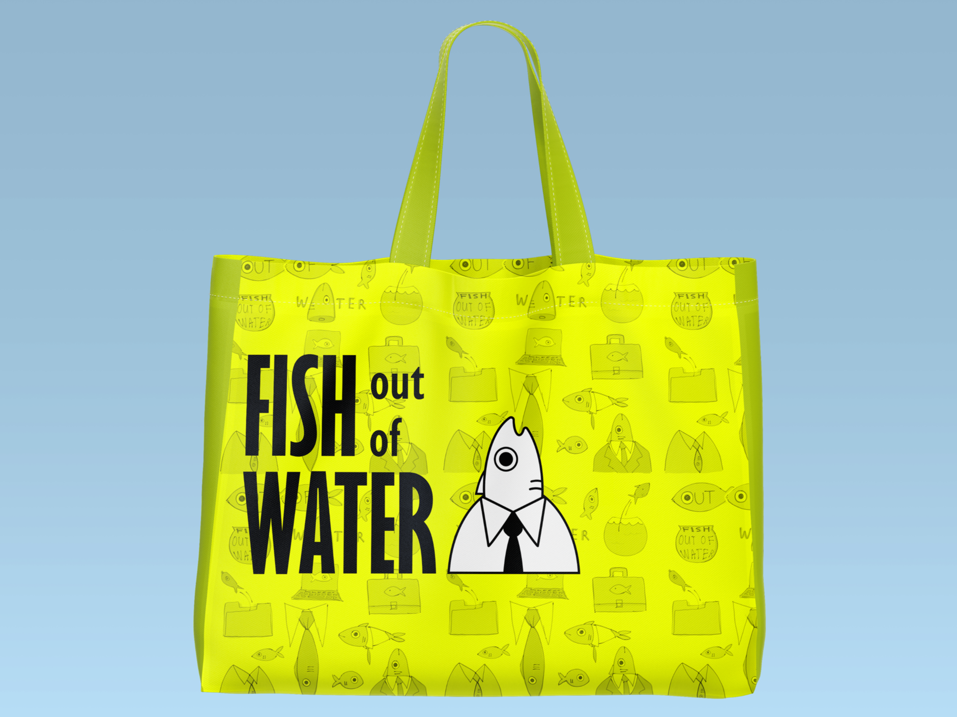
Then I combined the logo, wordmark, and some of my original sketches into a tote bag design.
tote bag
Artifact Creation
Once the branding was finalized, I started applying it to mockup materials.
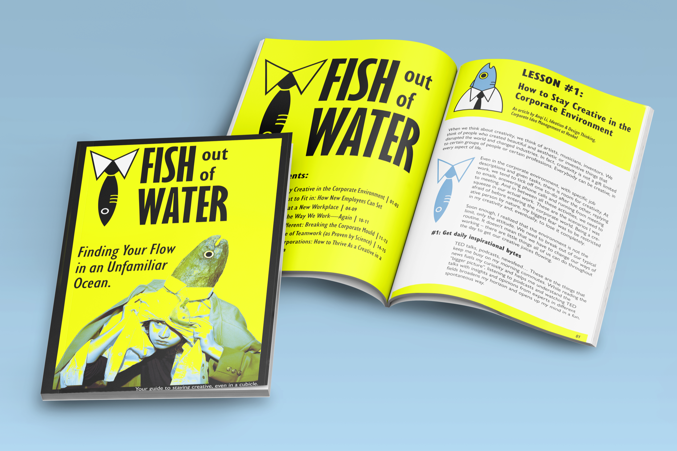
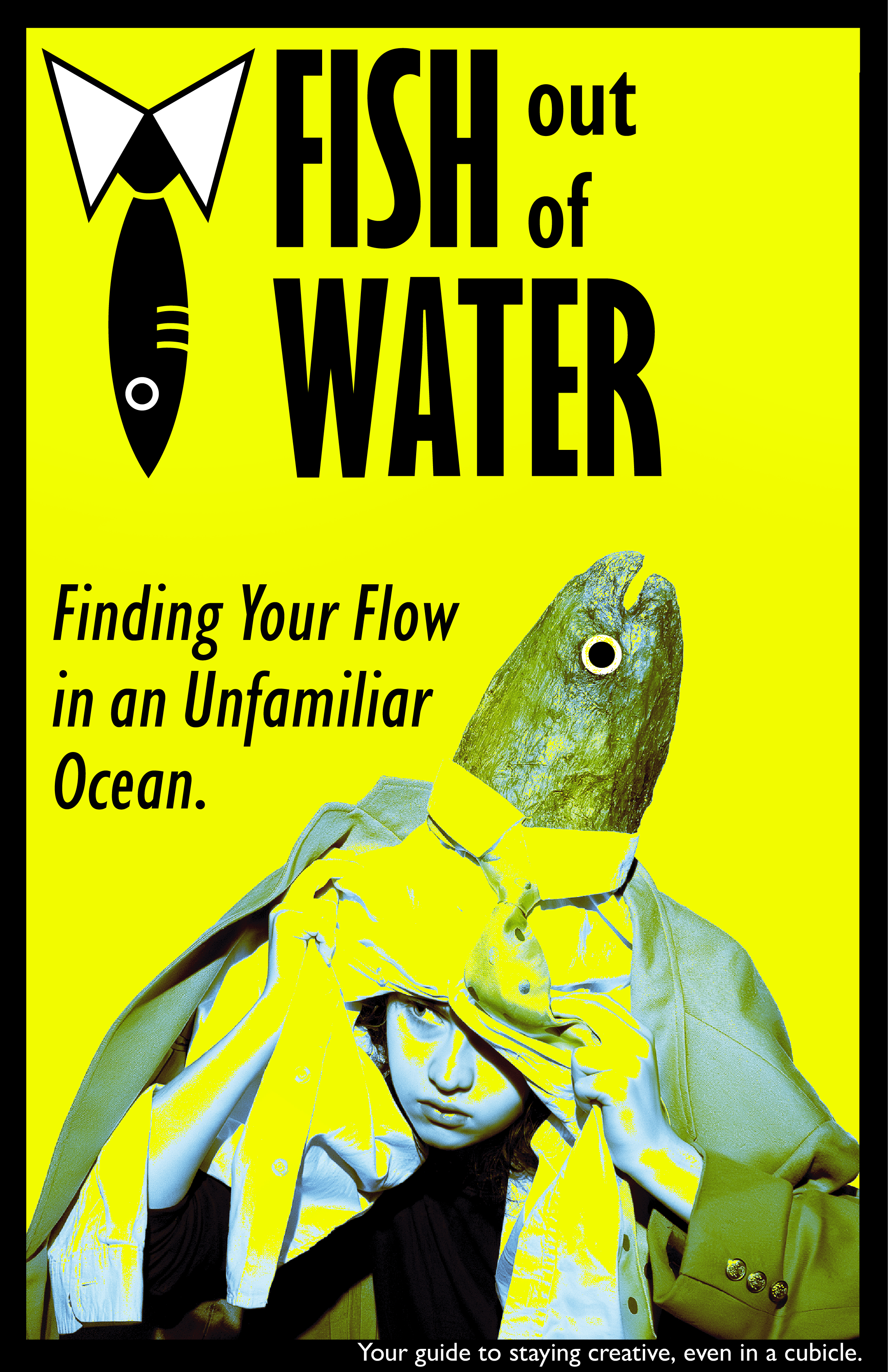
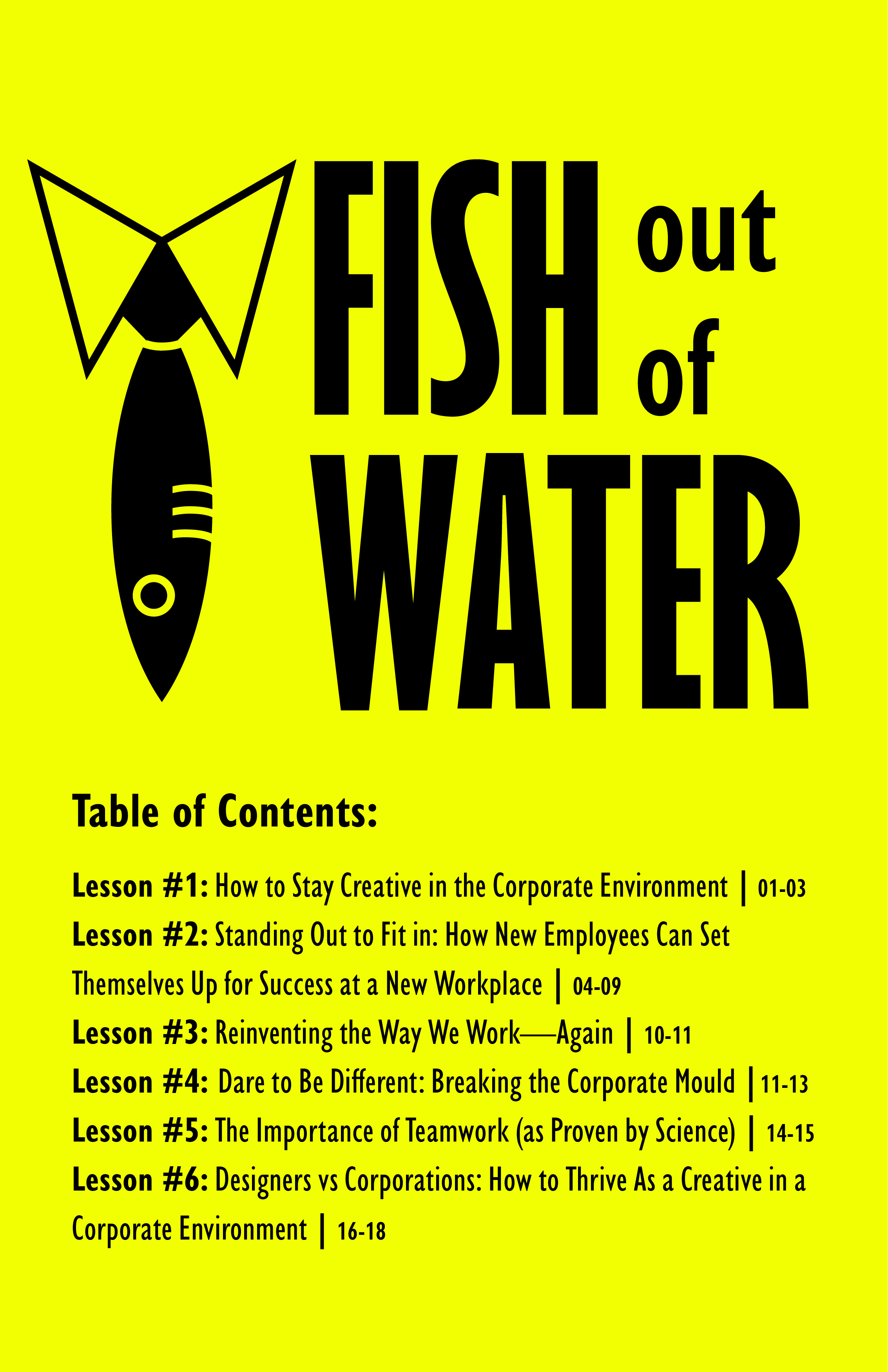
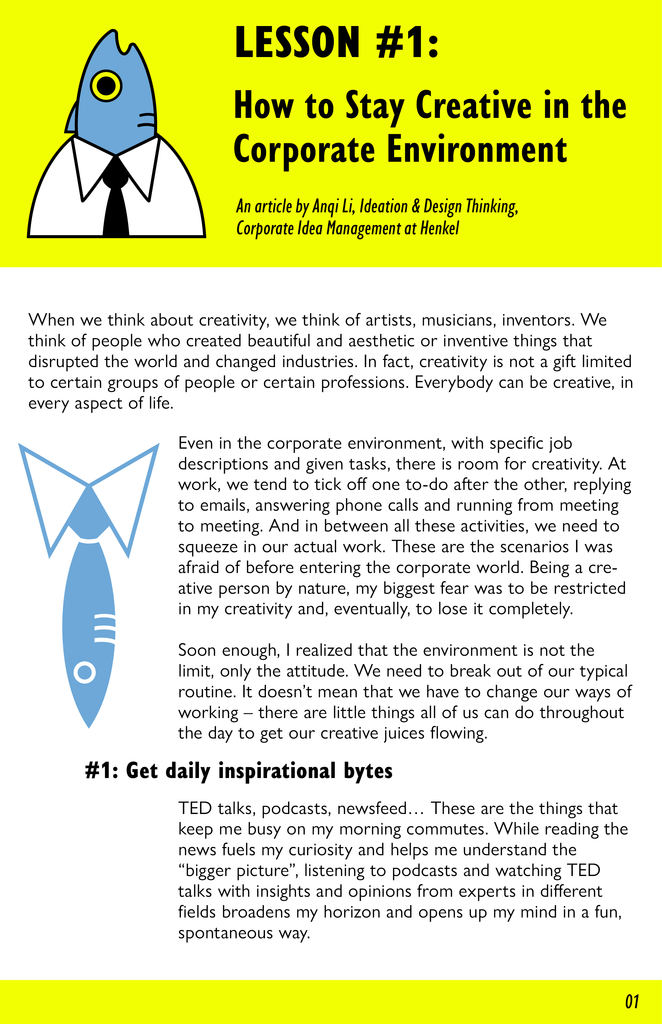
Booklet
For the booklet, I designed a cover using original photography alongside the logos and wordmark. Inside, I featured a relevant article I found online, and created a table of contents using real article titles as stand-ins for potential content.

Final Deliverables